Wednesday, August 10, 2011

Combat duck

Ducks in action
This 4 colors print is for Mamtak - cocoa spread manufactured by Mata food industries.
I have no idea how this spread tasted, but those ducks all over the napkin are not a good sign.
I don't know which one is a better choice, the crying duck (ugly duckling probably) or the soldier duck with the beret hat on the left. The one at the bottom seems like a nice dude, yet, no chocolate spread crave here.

Mata - Mamtak cocoa spread

Mata delicacies for your taste


Wednesday, August 3, 2011

A new direction

From left to right: Metula, Jerusalem, Damascus, Malabes (nowdays it's Petach-Tikvah), Eilat, Bnei-Brak, Cairo, Bat-Yam, Haifa, Tel-Aviv

Cairo or Bat-yam?

I found this awesome napkin in these hectic days, when Israel's citizens are uprising and demanding social justice. Probably being inspired by the citizens in our neighbor countries of the Middle east.
The illustrated road signs show names of cities in Israel like Tel-Aviv and Haifa and also the cities Cairo and Damascus in a casual way, as if the whole Middle east has no borders..
I wonder if someone tried to implant a message there since the napkin is most likely to be from the early 60's when a trip to Cairo was only a wild dream. (A trip to Damascus still is a dream for me and many others I guess).

All those to Damascus to the left

I love this little police-man at the corners.. In the old days they used to stand in junctions and control the traffic instead of traffic lights. It looked something like this.

Tuesday, May 10, 2011

Where soldiers smile

Atteeeeeeen-shan!
Especially for Israel's 63rd independence day, another napkin from the Souvenir of Israel series.
This 3 colors print show a collection of illustrated scenes taken from a typical service in the Israeli army. In those days I guess no one thought there's something totally weird about displaying this as a cute and smiley souvenir..
Happy birthday Israel. Hope we won't need soldiers on our napkins anymore.

Sunday, May 8, 2011

Independence day

Left: Independence day Tashcach (The Jewish calender year), Middle: logo - 20 Israel,
Right: "Revivim" school Kiryat Haim
A napkin from 1968 for Israel's 20 years of independence celebrations. Was printed for Revivim school in Kiryat Haim, where my mom was studying in those days, as a souvenir for the joyous holiday.
I can't imagine there will be any napkins given away on this year's celebrations..

Thursday, May 5, 2011

A long distance relationship

He loves me? She loves me? - Hebrew, English, French and Italian
Another sweet illustrated napkin describing a complex romantic situation. 3 colors print that create a lively scene and a skirt I wouldn't mind having for myself.

Sunday, May 1, 2011

A post royal wedding post

Gilton halls - were either in Tel Aviv or Ramat-Gan

After the royal wedding frenzy I felt things gotta be back in proportions. Spending 80 million pounds on a family event is something most of us will luckily never have to experience. Back in the 60's those who wanted a big and lavish wedding did it in event-halls. Big halls, usually decorated with tacky wallpapers, where the guests would sit around tables, enjoy the obligatory chicken while watching the young couple go all the way under the Chuppah.
This is one of a few event-halls napkins I have in the collection. Probably were collected at the event itself..

Gilton halls - logo

The randomly spaced typography around the logo indicates that it was probably hand written by someone with a good hand, yet no eraser. The messy logo combines the letters G and Gimel (ג) as for Gilton, plus some elements that are supposed to make it feel more royal (?).
I really wonder if there were any royal wedding napkins served at the table, and if they looked any better than this one.

Wednesday, April 27, 2011

In the air, in the sea, on the ground

The flowers go to Zahal
A lovely illustrated napkin with a surprisingly accurate 3 color print from the series "Souvenir of Israel". I love the cosmopolitan feeling! And the little dog!


Monday, April 25, 2011

Peekaboo, I see you!

Peekaboo - Kikar Malchei Israel 8 Tel-Aviv. Steak-bar Restaurant.

A sweet napkin for Peekaboo - Steak-bar and a restaurant. It was located in Kikar Malchei Israel  no. 8 (Malchei Israel square), now days Rabin square in Tel-Aviv. I couldn't find any information about this place or what's in its spot today. If you have any idea don't be shy and comment :)

Peekaboo - logo

The design is a mess but has it's grace. I really like the unique typography of the logo.
It seems like there was a so-so success with having a continuous visual language in this logo. Letters are also kinda wobbly so I guess it might be hand drawn. Still I really love the innovative design of the letter "Aleph" - א  (third from left).

Harpaz

I found the name Harpaz hiding in the corner. Is it the credit for the print house or the designer? If so, I think it's the first time I noticed a credit for a designer on a napkin.

Thursday, April 21, 2011

A souvenir of Mugrabi

A lake, a tower, a colosseum and a cinema (?)

on the back

This napkin from the "Souvenir of Israel" series shows some hot spots to remember.
A rather detailed illustration and a rich 3 color print. It displays the landscape of Tiberias and sea of the Galilee, Jerusalem's "Citradel" (Migdal David), the ancient Roman colosseum in Caeserea and then, a surprise. Mugrabi cinema hall in Tel-Aviv.
Unlike the citradel and colosseum that still remain standing in a very impressive condition after hundreds of years, Mugrabi cinema hall didn't survive a whole century. It was opened to business in 1930 and became an important cultural center and one of the most popular hang-outs in the early days of Tel-Aviv.
Unfortunately it was burned in 1986 and demolished in 1989.. Now days you can find a depressing parking lot where it stood, but probably not for long. Another big luxury residence is planned for this area instead of reviving the cinema hall. I guess the future residents will have a nice home theater system in their luxury apartment to watch films instead.

Wednesday, April 6, 2011

Got a flight tonight

In the running year I've been finding myself up in the air sipping Bloody Maries and chocking on dust flavored marble cakes more than I could have ever imagined. Today, just recovering from a very long flight back to Tokyo, from the deeps of my jet lag haze,  I found some lovely napkins from the 60's skies.

El Al airlines, Israel's flag carrier's logo in his 60's version (just before it was recreated by the great designer Dan Reisinger in 1971). A simple one color print for this airplane napkin. Simple and elegant!

El Al airplane napkin (plus some Bloody Mary stains)

And a big one

Another napkin from a past El Al flight. This time you can see the logo after (or before?) some changes. The basic structure of the logo was mostly kept, but in this version the logo was built up from star-of-David fractals.. 
On the other side of the napkin you can also find the nicely adapted Hebrew logo.

 El Al star of david logo

We are all made of stars - the Hebrew version

The last flight napkin comes from Arkia - Israel's biggest inner flights company of those days.
The logo has also changed since, but still keeps the orange and blue principle.

Arkia - old logo


Sunday, March 27, 2011

Israeli Japonism

A post dedicated to my beloved Japan.
These two beautiful napkins were also found in my mom's collection. Both show a western (or Israeli to be more accurate) interpretation of Japanese art and design. Or anyway, what people thought was in those days..

opened (plus some age stains)

folded

The first napkin is made out of very very delicate and soft paper which almost crumbled in my hands.
Not the usual rough type I'm used to find in the collection.
It shows a loose handed draw of probably mountain Fuji and 2 pagodas surrounded by a pink Sakura (cherry) or plum blossom. The illustration seems to have all the means to create a "Japanese" atmosphere but still there's something about the little details that feels like it's not the real thing we're seeing now. 
Stuff like the shape of the Sakura (cherry) flowers, the loose stroke and the background coloring make you feel that the artist might have never been to Japan and probably had drawn it with the aid of a photo and some and a hunch.
Anyways, this napkin is a real beauty. The 4 color print, special paper and the nicely cut edges show a good technical skill. A keeper!

opened


folded

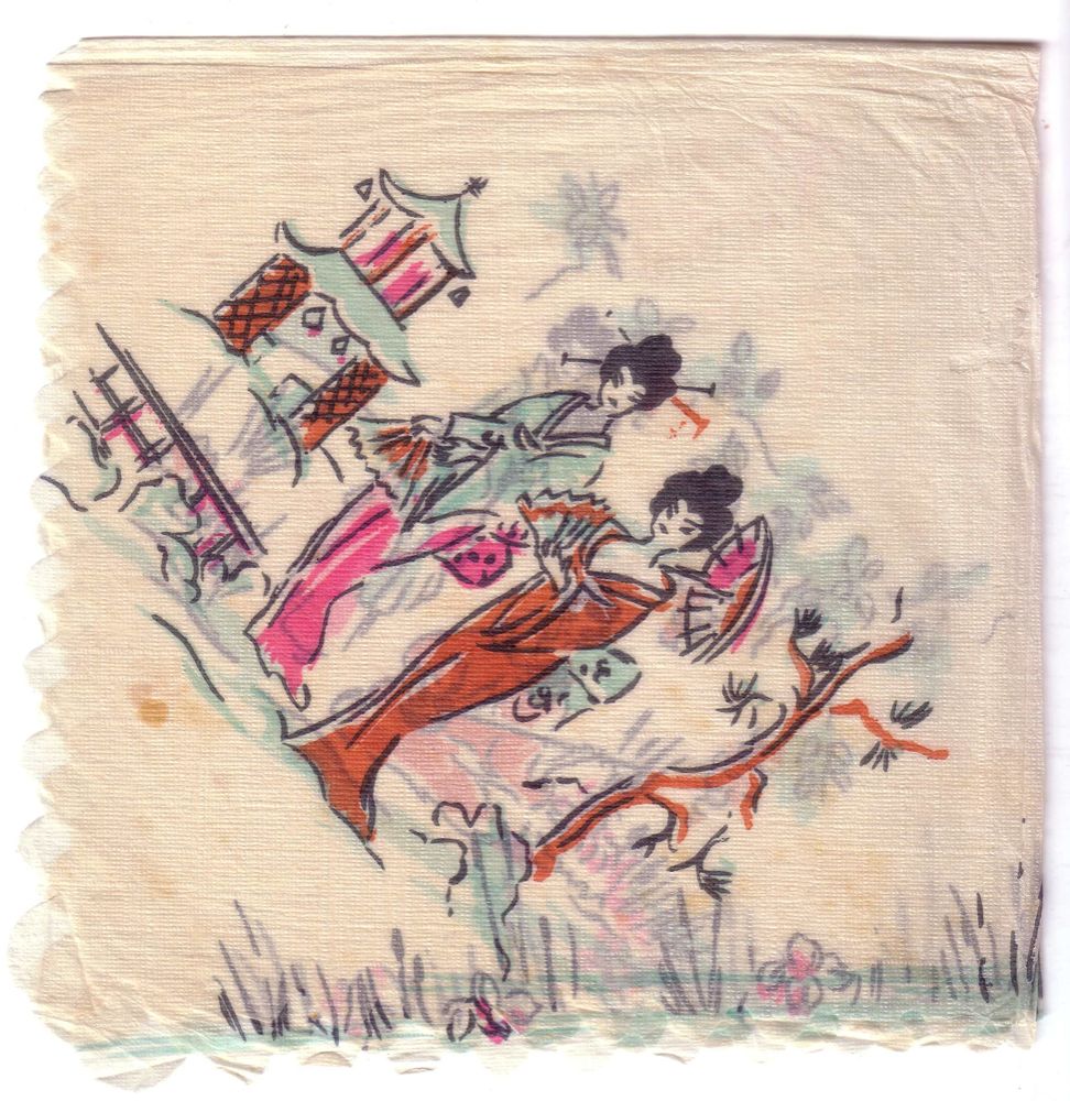
The second and also adorable napkin shows a lovely scene with some busy geishas. Here the hand drawing is pretty loose too. Maybe to cover for some lack of reference.. Seems like the shrine or temple was assembled with some quick strokes because the illustrator had no idea how a real one looks like. No Google in those days. Anyway he added some bells at the corners just in case.


Thursday, March 10, 2011

Holiday in Tiberias


Ganei Hamat Hotel - Logo

These two napkins are from the Ganei Hamat hotel in Tiberias. Now days the hotel is known as Rimonim Mineral Tiberias Hotel (After being Holiday Inn for many years) and has been quite famous for its mineral hot springs and for the big debate in the 80's with the ultra orthodox Haredi group when ancient bones were found buried in the hotel's territory while building an annex. History aside, check out the awesome 3 colors combination at the first napkin! 
They almost managed to create the green palm tree without being completely out of line. The second is the one color contour version of the hotel's logo. Is it the hotel's logo in two design versions? 
Dunno. If you have any idea you're welcomed to comment.


Monday, March 7, 2011

All night long

Le'Haim - Cheers


I can't stop thinking of this Lionel Richie's sticky 80's song looking at those 2 lovely napkins. Great party feeling with floating bubbles and cocktail glasses. Just great!
I really like the 3 color use for the Le'Haim napkin. The color print is relatively quite accurate and the combination and patterns create a vivid and vibrant feel.
The second one makes me feel like dancing tango by a lamp post. Le'Haim!

Friday, March 4, 2011

A Hebrew lesson

Dan Hotels - Table placemat

  
A nice way to kill your time until the scrambled egg arrives to your hotel breakfast table is to learn the native language. This is however what those two examples show.
One is from Dan hotels which still exist today and offer here a lesson and a rich breakfast. yum.

The second is from Beth Margoa in Kibbutz Shefayim. Beth Margoa (relaxing house) was the more affordable way to enjoy a relaxing vacation in the old days. Most people couldn't afford a fancy hotel and a trip abroad was a real luxury, so a weekend out of town in a green and quiet Kibbutz by the pool was a preferred option.  


Beth Margoa Shefayim - Table placemat


Beth Hamargoa Shefayim - logo

Thursday, March 3, 2011

Take me to the Milk-bar

Clockwise from top: Bon appetit, pudding bourekas, espresso sandwiches, blinchiki salads.

Milk bar - Tel aviv - Newe Shaanan 8
Zvika Milk-bar

One of the most popular hangout places in Israel of the 60's and 70's was the Milk-bar. A place you can enjoy a light meal and a milk-shake with your girlfriend at the times you couldn't go to the "real" bars.
Not so sure those places who offered pudding and bourekas had too much of the sex-appeal, but in those days that was the best in hand.
Both of these napkins are from 2 different Milk-bars. One was in Tel-Aviv and the other was in Haifa.
Both seem to be drawn by hand, including some typography which
has its charm now days.

The Zvika Milk-bar logo is without a doubt hand drawn (in a very naive way..) and influenced by the Israeli army paratroops symbol. After a short research I found out this place was named after Zvika Kestler. The paratroop son of the owner who lost his life in 1968 in the battles of the war of attrition (Ha'hatsha).
Now days this place functions as the old timer pub The Bear Inn (Pundak Ha'dov).


Wednesday, March 2, 2011

Visit Israel

Label on the back: Souvenir of Israel
This one is quite pretty. A pre 67' map view of Israel with all the touristic hot-spots.
Pretty much influenced by the American illustration style of those days and still has something more laid-back about it. I really like the textures created with the 3 color palette!

On the back you can find a label I found on many napkins in the collection.
Must have been published by the ministry of tourism. More from this series to come!

Tuesday, March 1, 2011

Every woman's dream

From Hebrew: Cooking with electricity, nice and easy


From Hebrew: More electricity, less work

From Hebrew:...And when we marry we'll also have Pazgaz at home


I have no idea what the national electricity company and a gas company need a promotional napkin for, but in the old days that was a good way to reach the people.
What is more typical for those days is the illustration of the happy and bashful housewife serving her faceless husband a hot drink while he's reading the newspaper after a long day at the rat-race.
Thanks to electricity, she can serve the hot tea faster than before and keep smiling. Thank you electricity!

On the second napkin for the Israeli gas company Pazgaz, you can see how to make a girl sky-rocket with joy. Marriage AND gas!

Yep those napkins seem funny today though sometimes I feel those messages aren't completely gone. Just became more sophisticated.

Drunk cats


 pink and purple

As a cat lover I would definitely be a regular in a bar that serves this kind of napkin with my Bloody mary. I really like the 2 color use to create all the little details so we understand there's a boy-girl situation here. I also found another colors combination for this design. Both are great!